New gmu.edu designed for more direct navigation
George Mason University has retired its “aesthetically nice” homepage and traded it for a new design to curb “information overload” for the different constituencies that use it.
The new site, built by the web communications staff in Mason’s Creative Services, is based on observations of web analytics over the past three years. Changes reflect what people most clicked, most searched for, and in general, what users are most likely trying to find when they log on. The site went live during a “soft” launch Sunday evening, and the official launch is scheduled for the first day of classes, Monday, Jan. 23.
“[The old site] was a beautiful site, with lots of accolades,” said Kim Shriver, the senior web designer and programmer in charge of the project. “It’s just too much information, and people haven’t been able to get to [the page] they’re looking for.”
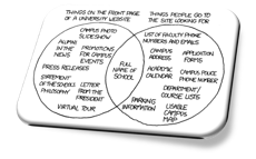
 Shriver called the well-shared xkcd.com cartoon outlining university website problems an "additional tool" used as justification for the design.
Download a Creative Services PDF on the redesign
Shriver, who has been with the university for two years, said the new design reflects best practices in university websites, which are starting to shift towards simpler design. As an example, she pointed to a 2010 Inside Higher Ed article discussing the “apparent disconnect between what some colleges choose to include on their home pages and what visitors actually want to find there.” Titled “No Laughing Matter,” the article featured an xkcd.com cartoon of a Venn diagram shared time and time again on the web.
Mason’s old site was “aesthetically nice,” said Shriver, but like the funny diagram, people weren’t getting where they wanted to go in a small amount of clicks. Some stats shared with Connect2Mason included the fact that users largely clicked “above the fold,” with little scrolling down the page. The “Mason in the News” tab also “just wasn’t being noticed,” and people would click on parts of the page – like the slide show images – that weren’t even linked.
“People were clicking on things that weren’t clickable,” Shriver said.
With aid from other staff members in University Relations, University Information and a student focus group, Shriver and her two core team members developed a navigation system that organizes information and quick links for the habits of different users. In addition to the quick links on the homepage, four user groups now have their own landing page: Students, Faculty and Staff, Schools and Colleges, and Centers and Institutes.
“We had a Students page before, [but] this one is more geared towards students,” Shriver said. “This one is actually what students want to know.”
Ideas from the student focus group were incorporated into the project, as were the opinions of the other two web team members, Wendy Chang and Will Rees. Chang is taking classes at Mason. Rees is a Mason graduate.
Other teams in Creative Services, including photography and writing and editing, contributed to the project's completion.
Two new sites also launched Sunday: “About Mason,” which provides an overview of the university, and “News Desk,” a news site run by the Office of Media and Public Relations. (The Gazette, longtime home for faculty and staff news, is officially out. A section for faculty and staff is part of the News Desk.)
Shriver said another page for “campus life” is expected to launch later this week.
The “physical stuff” for the web overhaul began at the start of Summer 2011, according to Shriver, who told Connect2Mason that the team is getting ready to work on more university websites, including the website for Dining Services.
Mason’s web presence is “unique” and differs from most universities, according to Shriver. Instead of being maintained by one department, there are “300 servers hosting multitudes of sites all over the place,” with many operated by separate staffs. The set-up provides a “challenge” for getting users where they want to go in a limited number of clicks.
“[We’re] trying to find some way to incorporate the best three-click rule that you can under those circumstances, and this [homepage redesign] addresses that to some degree,” said Shriver, who told us she is “always open to critique.”
“It’s not going to make it perfect, but it’s better than it was before,” she said.
8:50 a.m., Jan. 23 An earlier version of this piece left out the contributions of non-web development areas of Creative Services. It has been updated to reflect the collaboration.
10:30 a.m., Jan. 23 An earlier version of this piece stated that web team members Chang and Rees were both Mason graduates. Only Rees is a graduate.

